Base functions
epifitter provides functions to fit classic
two-parameter population dynamics models to disease progress curve (DPC)
data: exponential, monomolecular, logistic, and Gompertz.
The goal of fitting these models to DPCs is to estimate
epidemiologically meaningful parameters: y0, which
represents primary inoculum, and r, which represents the
apparent infection rate. Choosing the model that best describes the
epidemic helps users interpret disease progress and compare epidemics
more effectively.
Two approaches can be used to obtain the parameters:
- Linear regression models fitted to the transformed disease data required by each model.
- Non-linear regression models fitted to the original disease intensity data.
Both approaches are available in epifitter. The simplest way
to fit these models to a single epidemic is with fit_lin()
and fit_nlin(). The alternative fit_nlin2()
allows estimation of a third parameter, the upper asymptote, when the
maximum disease intensity is not close to 100%. The
fit_multi() function extends these workflows to multiple
epidemic datasets.
First, we need to load the packages we’ll need for this tutorial.
Basic usage
Dataset
To use epifitter, at least two variables are needed: one representing assessment time and another representing disease intensity as a proportion (for example, incidence, severity, or prevalence). In designed experiments with replicates, a third variable identifying the experimental units is also needed.
Let’s simulate a DPC dataset for one epidemic measured in replicated
plots. The simulated data resemble a polycyclic epidemic with a sigmoid
shape. We can generate this dataset with
sim_logistic().
dpcL <- sim_logistic(
  N = 100, # duration of the epidemics in days
  y0 = 0.01, # disease intensity at time zero
  dt = 10, # interval between assessments
  r = 0.1, # apparent infection rate
  alpha = 0.2, # level of noise
  n = 7 # number of replicates
)
Let’s give a look at the simulated dataset.
| replicates | time | y | random_y |
|---|---|---|---|
| 1 | 0 | 0.0100 | 0.0100 |
| 1 | 10 | 0.0267 | 0.0281 |
| 1 | 20 | 0.0695 | 0.0380 |
| 1 | 30 | 0.1687 | 0.1685 |
| 1 | 40 | 0.3555 | 0.3840 |
| 1 | 50 | 0.5999 | 0.6550 |
The object generated by sim_logistic() is a data frame
with four columns. The y variable contains disease
intensity values on a proportional scale (0 < y < 1). To
facilitate visualization, we can plot the epidemic with the
ggplot2 package.
ggplot(
  dpcL,
  aes(time, y,
    group = replicates
  )
) +
  geom_point(aes(time, random_y), shape = 1) + # plot the replicate values
  geom_point(color = "steelblue", size = 2) +
  geom_line(color = "steelblue") +
  labs(
    title = "Simulated 'complete' epidemics of sigmoid shape",
    subtitle = "Produced using sim_logistic()"
  )+
  theme_minimal_hgrid()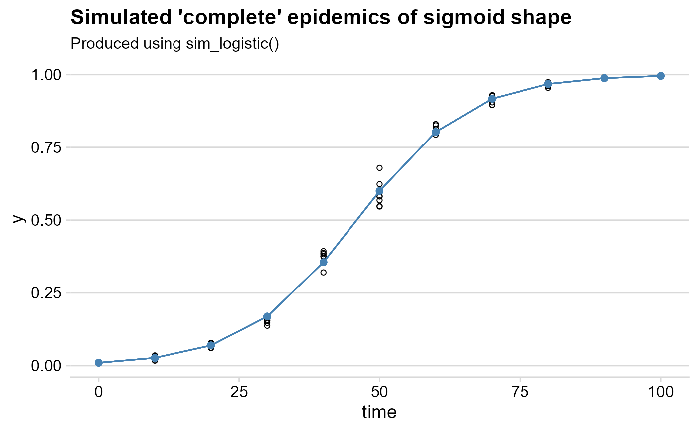
Linear regression using fit_lin()
The fit_lin() requires at least the time
and y arguments. In the example, we will call the
random_y which represents the replicates. A quick way to
call these variables attached to the dataframe is shown below.
f_lin <- fit_lin(
  time = dpcL$time,
  y = dpcL$random_y
)
fit_lin() outputs a list object which contains several
elements. Three elements of the list are shown by default: stats of
model fit, Infection rate and Initial Inoculum
f_lin## Results of fitting population models
##
## Stats:
## CCC r_squared RSE
## Logistic 0.9977 0.9955 0.2146
## Gompertz 0.9776 0.9563 0.4873
## Monomolecular 0.9367 0.8809 0.6480
## Exponential 0.9131 0.8402 0.6237
##
## Infection rate:
## Estimate Std.error Lower Upper
## Logistic 0.09961316 0.0007732535 0.09807276 0.10115356
## Gompertz 0.07111327 0.0017559327 0.06761527 0.07461126
## Monomolecular 0.05498609 0.0023351295 0.05033427 0.05963791
## Exponential 0.04462707 0.0022475856 0.04014965 0.04910449
##
## Initial inoculum:
## Estimate Linearized lin.SE Lower Upper
## Logistic 1.014725e-02 -4.580354 0.04574629 9.271593e-03 0.0111046715
## Gompertz 3.243387e-05 -2.335663 0.10388238 3.012411e-06 0.0002239497
## Monomolecular -1.776962e+00 -1.021357 0.13814812 -2.656706e+00 -1.1088701071
## Exponential 2.846738e-02 -3.558996 0.13296895 2.184279e-02 0.0371010991Model fit stats
The Stats element of the list shows how each of the four
models predicted the observations based on three measures:
- Lin’s concordance correlation coefficient
CCC(Lin 2000), a measure of agreement that takes both bias and precision into account - Coefficient of determination
r_squared(R2), a measure of precision - Residual standard deviation
RSEfor each model.
The four models are sorted from the high to the low CCC.
As expected because the sim_logistic function was used to
create the synthetic epidemic data, the the Logistic model was
superior to the others.
Model coefficients
The estimates, and respective standard error and upper and lower 95%
confidence interval, for the two coefficients of interest are shown in
the Infection rate and Initial inoculum
elements. For the latter, both the back-transformed (estimate) and the
linearized estimate are shown.
Global stats
The element f_lin$stats_all provides a wide format
dataframe with all the stats for each model.
knitr::kable(f_lin$stats_all, digits = 4)| best_model | model | r | r_se | r_ci_lwr | r_ci_upr | v0 | v0_se | r_squared | RSE | CCC | y0 | y0_ci_lwr | y0_ci_upr |
|---|---|---|---|---|---|---|---|---|---|---|---|---|---|
| 1 | Logistic | 0.0996 | 0.0008 | 0.0981 | 0.1012 | -4.5804 | 0.0457 | 0.9955 | 0.2146 | 0.9977 | 0.0101 | 0.0093 | 0.0111 |
| 2 | Gompertz | 0.0711 | 0.0018 | 0.0676 | 0.0746 | -2.3357 | 0.1039 | 0.9563 | 0.4873 | 0.9776 | 0.0000 | 0.0000 | 0.0002 |
| 3 | Monomolecular | 0.0550 | 0.0023 | 0.0503 | 0.0596 | -1.0214 | 0.1381 | 0.8809 | 0.6480 | 0.9367 | -1.7770 | -2.6567 | -1.1089 |
| 4 | Exponential | 0.0446 | 0.0022 | 0.0401 | 0.0491 | -3.5590 | 0.1330 | 0.8402 | 0.6237 | 0.9131 | 0.0285 | 0.0218 | 0.0371 |
Model predictions
The predicted values are stored as a dataframe in the
data element called using the same $ operator
as above. Both the observed and (y) and the
back-transformed predictions (predicted) are shown for each
model. The linearized value and the residual are also shown.
| time | y | model | linearized | predicted | residual |
|---|---|---|---|---|---|
| 0 | 0.0100 | Exponential | -4.6052 | 0.0285 | -0.0185 |
| 0 | 0.0100 | Monomolecular | 0.0101 | -1.7770 | 1.7870 |
| 0 | 0.0100 | Logistic | -4.5951 | 0.0101 | -0.0001 |
| 0 | 0.0100 | Gompertz | -1.5272 | 0.0000 | 0.0100 |
| 10 | 0.0281 | Exponential | -3.5736 | 0.0445 | -0.0164 |
| 10 | 0.0281 | Monomolecular | 0.0285 | -0.6024 | 0.6304 |
Plot of predictions
The plot_fit() produces, by default, a panel of plots
depicting the observed and predicted values by all fitted models. The
arguments pont_size and line_size that control
for the size of the dots for the observation and the size of the fitted
line, respectively.
plot_lin <- plot_fit(f_lin,
  point_size = 2,
  line_size = 1
)

# Default plots
plot_lin 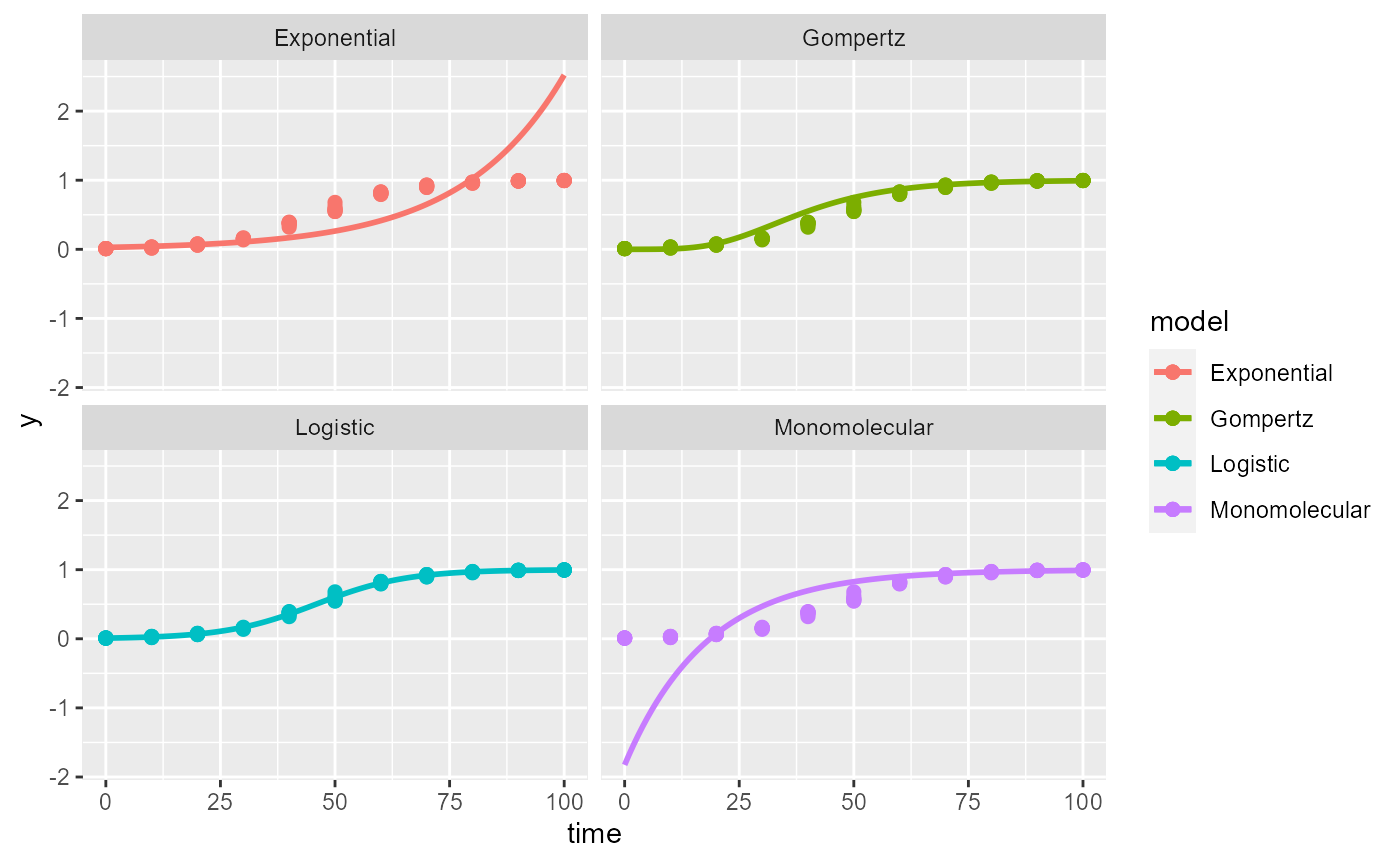
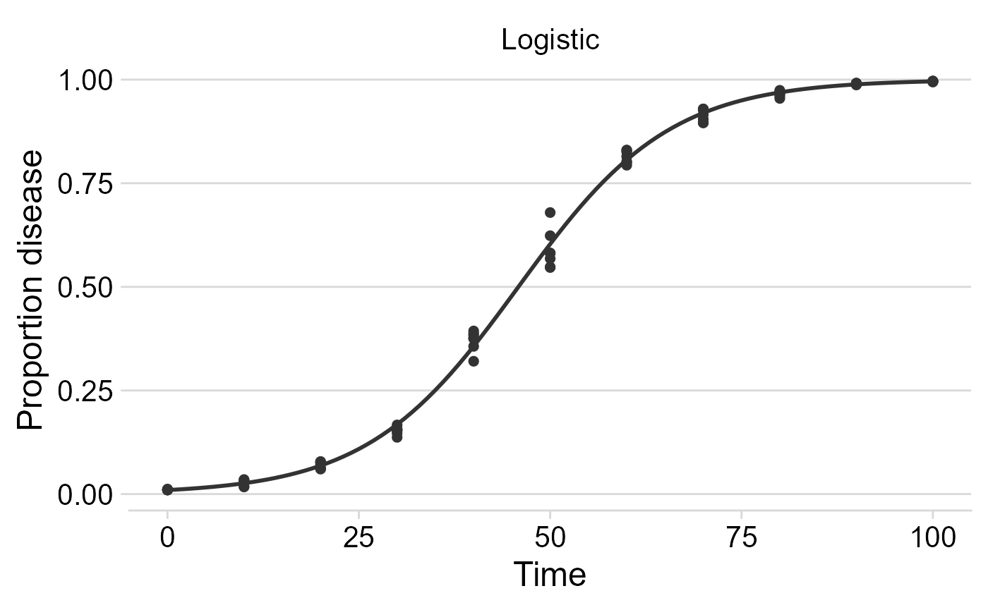
Publication-ready plots
The plots are ggplot2 objects which can be easily customized
by adding new layers that override plot paramaters as shown below. The
argument models allows to select the models(s) to be shown
on the plot. The next plot was customized for the logistic model.
# Customized plots

plot_fit(f_lin,
  point_size = 2,
  line_size = 1,
  models = "Logistic")+
  theme_minimal_hgrid(font_size =18) +
  scale_x_continuous(limits = c(0,100))+
  scale_color_grey()+
   theme(legend.position = "none")+
  labs(
    x = "Time",
    y = "Proportion disease "

  )
Non-linear regression
Two-parameters
The fit_nlin() function uses the Levenberg-Marquardt
algorithm for least-squares estimation of nonlinear parameters. In
addition to time and disease intensity, starting values for
y0 and r should be given in the
starting_par argument. The output format and interpretation
is analogous to the fit_lin().
NOTE: If you encounter error messages saying “matrix at initial parameter estimates”, try to modify the starting values for the parameters to solve the problem.
f_nlin <- fit_nlin(
  time = dpcL$time,
  y = dpcL$random_y,
  starting_par = list(y0 = 0.01, r = 0.03)
)

f_nlin
## Results of fitting population models
##
## Stats:
## CCC r_squared RSE
## Logistic 0.9982 0.9963 0.0246
## Gompertz 0.9959 0.9933 0.0367
## Exponential 0.8869 0.8245 0.1758
## Monomolecular NA NA NA
##
## Infection rate:
## Estimate Std.error Lower Upper
## Logistic 0.10250959 0.002086494 0.09835308 0.10666609
## Gompertz 0.07226208 0.002129110 0.06802067 0.07650348
## Exponential 0.01916079 0.001407090 0.01635772 0.02196386
## Monomolecular NA NA NA NA
##
## Initial inoculum:
## Estimate Std.error Lower Upper
## Logistic 8.533242e-03 8.419049e-04 6.856081e-03 1.021040e-02
## Gompertz 1.466911e-08 2.542743e-08 -3.598492e-08 6.532314e-08
## Exponential 1.787016e-01 2.092668e-02 1.370135e-01 2.203897e-01
## Monomolecular NA NA NA NAWe can check the results using plot_fit.
plot_fit(f_nlin) +
  theme_minimal_hgrid()#changing plot theme
## Warning: Removed 101 rows containing missing values or values outside the scale range
## (`geom_line()`).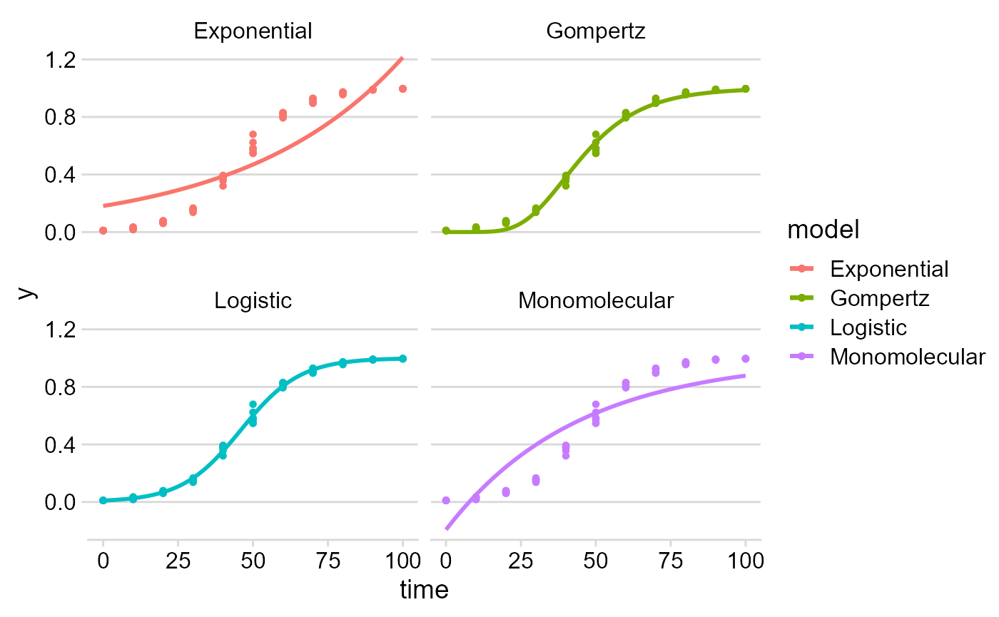
Estimating K (maximum disease)
In many epidemics the last measure (final time) of a DPC does not
reach the maximum intensity and, for this reason, estimation of maximum
asymptote (carrying capacity K) may be necessary. The
fin_lin2() provides an estimation of K in
addition to the estimates provided by fit_lin().
Before demonstrating the function, we can transform our simulated
data by creating another variable with y_random2 with
maximum about 0.8 (80%). Simplest way is to multiply the
y_random by 0.8.
Then we run the fit_nlin2() for the new dataset.
f_nlin2 <- fit_nlin2(
  time = dpcL2$time,
  y = dpcL2$random_y,
  starting_par = list(y0 = 0.01, r = 0.2, K =  0.6)
)
f_nlin2
## Results of fitting population models
##
## Stats:
## CCC r_squared RSE
## Logistic 0.9982 0.9963 0.0198
## Gompertz 0.9965 0.9939 0.0275
## Monomolecular NA NA NA
##
## Infection rate:
## Estimate Std.error Lower Upper
## Logistic 0.10267337 0.002532523 0.09762721 0.10771953
## Gompertz 0.06535311 0.002535110 0.06030179 0.07040442
## Monomolecular NA NA NA NA
##
## Initial inoculum:
## Estimate Std.error Lower Upper
## Logistic 6.784477e-03 7.643834e-04 5.261410e-03 8.307544e-03
## Gompertz 5.923352e-07 8.447990e-07 -1.090964e-06 2.275634e-06
## Monomolecular NA NA NA NA
##
## Maximum disease intensity:
## Estimate Std.error Lower Upper
## Logistic 0.7994452 0.004854938 0.7897715 0.8091189
## Gompertz 0.8289752 0.009009765 0.8110228 0.8469275
## Monomolecular NA NA NA NA
plot_fit(f_nlin2)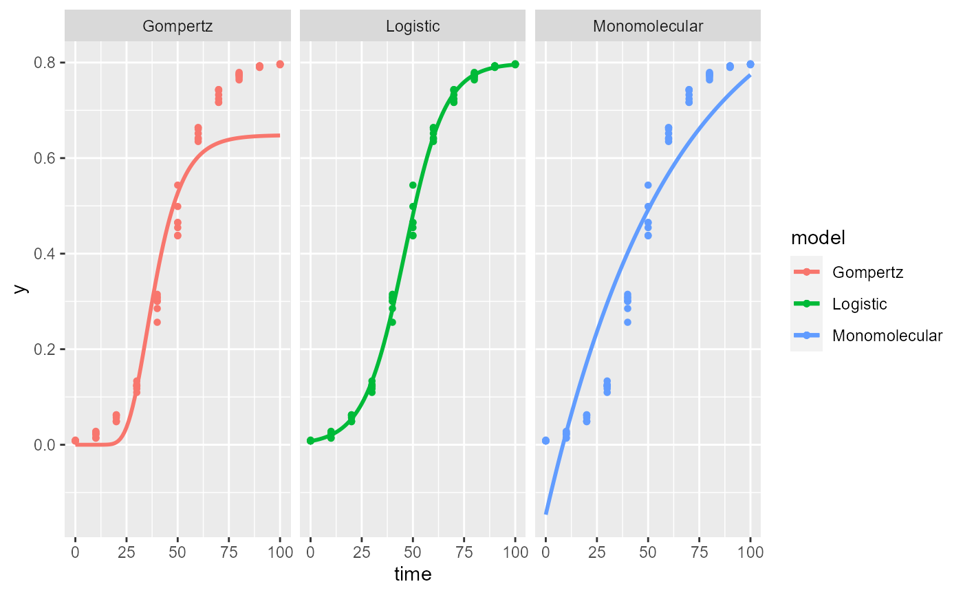
NOTE: The exponential model is not included because it doesn’t have a maximum asymptote. The estimated value of
Kis the expected 0.8.
Fit models to multiple DPCs
Most commonly, there are more than one epidemics to analyse either
from observational or experimental studies. When the goal is to fit a
common model to all curves, the fit_multi() function is in
hand. Each DPC needs an unique identified to further combined in a
single data frame.
Data
Let’s use the sim_ family of functions to create three
epidemics and store the data in a single data.frame. The
Gompertz model was used to simulate these data. Note that we allowed to
the y0 and r parameter to differ the DPCs. We
should combine the three DPCs using the bind_rows()
function and name the identifier (.id), automatically
created as a character vector, for each epidemics as ‘DPC’.
epi1 <- sim_gompertz(N = 60, y0 = 0.001, dt = 5, r = 0.1, alpha = 0.4, n = 4)
epi2 <- sim_gompertz(N = 60, y0 = 0.001, dt = 5, r = 0.12, alpha = 0.4, n = 4)
epi3 <- sim_gompertz(N = 60, y0 = 0.003, dt = 5, r = 0.14, alpha = 0.4, n = 4)

multi_epidemic <- bind_rows(epi1,
  epi2,
  epi3,
  .id = "DPC"
)
knitr::kable(head(multi_epidemic), digits = 4)| DPC | replicates | time | y | random_y |
|---|---|---|---|---|
| 1 | 1 | 0 | 0.0010 | 0.0010 |
| 1 | 1 | 5 | 0.0152 | 0.0162 |
| 1 | 1 | 10 | 0.0788 | 0.0762 |
| 1 | 1 | 15 | 0.2141 | 0.3436 |
| 1 | 1 | 20 | 0.3927 | 0.5165 |
| 1 | 1 | 25 | 0.5672 | 0.6408 |
We can visualize the three DPCs in a same plot
p_multi <- ggplot(multi_epidemic,
       aes(time, y, shape = DPC, group = DPC))+
  geom_point(size =2)+
  geom_line()+
  theme_minimal_grid(font_size =18) +
   labs(
    x = "Time",
    y = "Proportion disease "

  )
p_multi
Or use facet_wrap() for ploting them separately.
p_multi +
  facet_wrap(~ DPC, ncol = 1)
Using fit_multi()
fit_multi() requires at least four arguments: time,
disease intensity (as proportion), data and the curve identifier
(strata_cols). The latter argument accepts one or more
strata include as c("strata1",strata2"). In the example
below, the stratum name is DPC, the name of the
variable.
By default, the linear regression is fitted to data but adding
another argument nlin = T, the non linear regressions is
fitted instead.
multi_fit <- fit_multi(
  time_col = "time",
  intensity_col = "random_y",
  data = multi_epidemic,
  strata_cols = "DPC"
)
All parameters of the list can be returned using the $ operator as below.
| DPC | best_model | model | r | r_se | r_ci_lwr | r_ci_upr | v0 | v0_se | r_squared | RSE | CCC | y0 | y0_ci_lwr | y0_ci_upr |
|---|---|---|---|---|---|---|---|---|---|---|---|---|---|---|
| 1 | 1 | Gompertz | 0.1010 | 0.0027 | 0.0955 | 0.1065 | -1.8740 | 0.0965 | 0.9648 | 0.3684 | 0.9821 | 0.0015 | 0.0004 | 0.0047 |
| 1 | 2 | Monomolecular | 0.0730 | 0.0032 | 0.0667 | 0.0794 | -0.5698 | 0.1120 | 0.9140 | 0.4275 | 0.9550 | -0.7679 | -1.2140 | -0.4116 |
| 1 | 3 | Logistic | 0.1602 | 0.0081 | 0.1440 | 0.1765 | -4.5241 | 0.2856 | 0.8872 | 1.0899 | 0.9403 | 0.0107 | 0.0061 | 0.0189 |
| 1 | 4 | Exponential | 0.0872 | 0.0094 | 0.0682 | 0.1062 | -3.9543 | 0.3339 | 0.6303 | 1.2741 | 0.7733 | 0.0192 | 0.0098 | 0.0375 |
| 2 | 1 | Gompertz | 0.1206 | 0.0031 | 0.1144 | 0.1269 | -1.9129 | 0.1099 | 0.9678 | 0.4195 | 0.9837 | 0.0011 | 0.0002 | 0.0044 |
| 2 | 2 | Monomolecular | 0.0947 | 0.0038 | 0.0870 | 0.1024 | -0.7282 | 0.1357 | 0.9241 | 0.5179 | 0.9605 | -1.0714 | -1.7206 | -0.5772 |
Similarly, all data can be returned.
| DPC | time | y | model | linearized | predicted | residual |
|---|---|---|---|---|---|---|
| 1 | 0 | 0.0010 | Exponential | -6.9078 | 0.0192 | -0.0182 |
| 1 | 0 | 0.0010 | Monomolecular | 0.0010 | -0.7679 | 0.7689 |
| 1 | 0 | 0.0010 | Logistic | -6.9068 | 0.0107 | -0.0097 |
| 1 | 0 | 0.0010 | Gompertz | -1.9326 | 0.0015 | -0.0005 |
| 1 | 5 | 0.0162 | Exponential | -4.1238 | 0.0297 | -0.0135 |
| 1 | 5 | 0.0162 | Monomolecular | 0.0163 | -0.2270 | 0.2432 |
If nonlinear regression is preferred, the nlim argument
should be set to TRUE
multi_fit2 <- fit_multi(
  time_col = "time",
  intensity_col = "random_y",
  data = multi_epidemic,
  strata_cols = "DPC",
  nlin = TRUE)
knitr::kable(head(multi_fit2$Parameters), digits = 4)| DPC | model | y0 | y0_se | r | r_se | df | CCC | r_squared | RSE | y0_ci_lwr | y0_ci_upr | r_ci_lwr | r_ci_upr | best_model |
|---|---|---|---|---|---|---|---|---|---|---|---|---|---|---|
| 1 | Gompertz | 0.0018 | 0.0011 | 0.1034 | 0.0043 | 50 | 0.9925 | 0.9854 | 0.0463 | -0.0003 | 0.0040 | 0.0948 | 0.1120 | 1 |
| 1 | Logistic | 0.0354 | 0.0067 | 0.1489 | 0.0084 | 50 | 0.9875 | 0.9783 | 0.0598 | 0.0218 | 0.0489 | 0.1320 | 0.1657 | 2 |
| 1 | Exponential | 0.2513 | 0.0315 | 0.0259 | 0.0026 | 50 | 0.8476 | 0.7652 | 0.1880 | 0.1880 | 0.3145 | 0.0206 | 0.0312 | 3 |
| 1 | Monomolecular | NA | NA | NA | NA | NA | NA | NA | NA | NA | NA | NA | NA | 4 |
| 2 | Gompertz | 0.0019 | 0.0013 | 0.1157 | 0.0057 | 50 | 0.9906 | 0.9815 | 0.0523 | -0.0008 | 0.0045 | 0.1041 | 0.1272 | 1 |
| 2 | Logistic | 0.0348 | 0.0067 | 0.1667 | 0.0095 | 50 | 0.9887 | 0.9789 | 0.0571 | 0.0213 | 0.0483 | 0.1477 | 0.1858 | 2 |
Want to estimate K?
If you want to estimate K, set nlin = TRUE
and estimate_K = TRUE.
NOTE: If you do not set both arguments
TRUE,Kwill not be estimated, becausenlindefaut isFALSE. Also remember that when estimating K, we don’t fit the Exponential model.
multi_fit_K <- fit_multi(
  time_col = "time",
  intensity_col = "random_y",
  data = multi_epidemic,
  strata_cols = "DPC",
  nlin = T,
  estimate_K = T
)| DPC | model | y0 | y0_se | r | r_se | K | K_se | df | CCC | r_squared | RSE | y0_ci_lwr | y0_ci_upr | r_ci_lwr | r_ci_upr | K_ci_lwr | K_ci_upr | best_model |
|---|---|---|---|---|---|---|---|---|---|---|---|---|---|---|---|---|---|---|
| 1 | Gompertz | 0.0018 | 0.0013 | 0.1034 | 0.0063 | 1 | 0.0157 | 49 | 0.9925 | 0.9854 | 0.0468 | -0.0008 | 0.0044 | 0.0908 | 0.1160 | 0.9685 | 1.0315 | 1 |
| 1 | Logistic | 0.0354 | 0.0075 | 0.1489 | 0.0102 | 1 | 0.0168 | 49 | 0.9875 | 0.9783 | 0.0605 | 0.0202 | 0.0505 | 0.1283 | 0.1694 | 0.9663 | 1.0337 | 2 |
| 1 | Monomolecular | NA | NA | NA | NA | NA | NA | NA | NA | NA | NA | NA | NA | NA | NA | NA | NA | 3 |
| 2 | Gompertz | 0.0019 | 0.0015 | 0.1157 | 0.0077 | 1 | 0.0151 | 49 | 0.9906 | 0.9815 | 0.0528 | -0.0012 | 0.0049 | 0.1001 | 0.1312 | 0.9696 | 1.0304 | 1 |
| 2 | Logistic | 0.0348 | 0.0073 | 0.1667 | 0.0111 | 1 | 0.0142 | 49 | 0.9887 | 0.9789 | 0.0577 | 0.0201 | 0.0495 | 0.1445 | 0.1890 | 0.9715 | 1.0285 | 2 |
| 2 | Monomolecular | NA | NA | NA | NA | NA | NA | NA | NA | NA | NA | NA | NA | NA | NA | NA | NA | 3 |
Graphical outputs
Use ggplot2
to produce elegant data visualizations of models curves and the
estimated parameters.
DPCs and fitted curves
The original data and the predicted values by each model are stored
in multi_fit$Data. A nice plot can be produced as
follows:
multi_fit$Data %>%
  ggplot(aes(time, predicted, color = DPC)) +
  geom_point(aes(time, y), color = "gray") +
  geom_line(size = 1) +
  facet_grid(DPC ~ model, scales = "free_y") +
  theme_minimal_hgrid()+
  coord_cartesian(ylim = c(0, 1))
## Warning: Using `size` aesthetic for lines was deprecated in ggplot2 3.4.0.
## ℹ Please use `linewidth` instead.
## This warning is displayed once every 8 hours.
## Call `lifecycle::last_lifecycle_warnings()` to see where this warning was
## generated.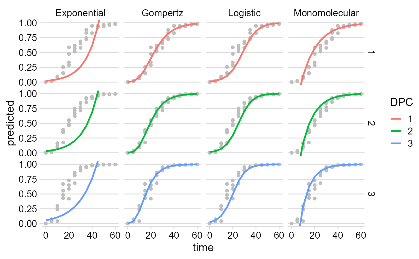
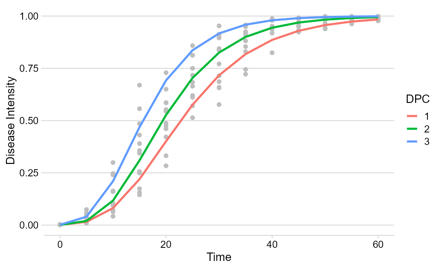
Using the dplyr function filter only the model
of interest can be chosen for plotting.
multi_fit$Data %>%
  filter(model == "Gompertz") %>%
  ggplot(aes(time, predicted, color = DPC)) +
  geom_point(aes(time, y),
    color = "gray",
    size = 2
  ) +
  geom_line(size = 1.2) +
  theme_minimal_hgrid() +
  labs(
    x = "Time",
    y = "Disease Intensity"
  )
Apparent infection rate
The multi_fit$Parameters element is where all stats and
parameters as stored. Let’s plot the estimates of the apparent infection
rate.
multi_fit$Parameters %>%
  filter(model == "Gompertz") %>%
  ggplot(aes(DPC, r)) +
  geom_point(size = 3) +
  geom_errorbar(aes(ymin = r_ci_lwr, ymax = r_ci_upr),
    width = 0,
    size = 1
  ) +
  labs(
    x = "Time",
    y = "Apparent infection rate"
  ) +
  theme_minimal_hgrid()