Simulating disease progress curves
Kaique S Alves
2026-04-11
Source:vignettes/simulation.Rmd
simulation.RmdIntroduction
In epifitter, the sim_ family of functions
complements the fit_ functions by generating synthetic
disease progress curve data from known model parameters. The same four
population dynamics models supported for fitting can also be
simulated.
These functions use deSolve::ode() (Soetaert, Petzoldt,
and Setzer 2010) to solve the differential equation form of the
epidemiological models.
Hands On
The basics of the simulation
The sim_ functions share the same core set of arguments.
By default, only two are strictly required, while the others have
sensible defaults.
-
r: apparent infection rate -
n: number of replicates
When n is greater than one, replicated epidemics are
produced and the alpha argument controls the level of noise
(experimental variation). Together, these arguments generate
random_y values that vary among replicates.
The other arguments are:
-
N: epidemic duration in time units -
dt: time (fixed) in units between two assessments -
y0: initial inoculum -
alpha: noise parameter controlling replicate-level variation
Exponential
Let’s simulate a curve resembling exponential growth.
exp_model <- sim_exponential(
  N = 100,    # total time units
  y0 = 0.01,  # initial inoculum
  dt = 10,    #  interval between assessments in time units
  r = 0.045,  #  apparent infection rate
  alpha = 0.2,# level of noise
  n = 7       # number of replicates
)
knitr::kable(head(exp_model), digits = 4)| replicates | time | y | random_y |
|---|---|---|---|
| 1 | 0 | 0.0100 | 0.0100 |
| 1 | 10 | 0.0157 | 0.0165 |
| 1 | 20 | 0.0246 | 0.0126 |
| 1 | 30 | 0.0386 | 0.0385 |
| 1 | 40 | 0.0605 | 0.0680 |
| 1 | 50 | 0.0949 | 0.1167 |
A data.frame is produced with four columns:
-
replicates: replicate identifier -
time: the assessment time -
y: simulated disease intensity on a proportional scale -
random_y: replicate-specific disease intensity after adding noise
Use ggplot2
to visualize the simulated curves.
exp_plot = exp_model %>%
  ggplot(aes(time, y)) +
  geom_jitter(aes(time, random_y), size = 3,color = "gray", width = .1) +
  geom_line(size = 1) +
  theme_minimal_hgrid() +
  ylim(0,1)+
  labs(
    title = "Exponential",
    y = "Disease intensity",
    x = "Time"
  )
## Warning: Using `size` aesthetic for lines was deprecated in ggplot2 3.4.0.
## ℹ Please use `linewidth` instead.
## This warning is displayed once every 8 hours.
## Call `lifecycle::last_lifecycle_warnings()` to see where this warning was
## generated.
exp_plot## Warning: Removed 1 row containing missing values or values outside the scale range
## (`geom_point()`).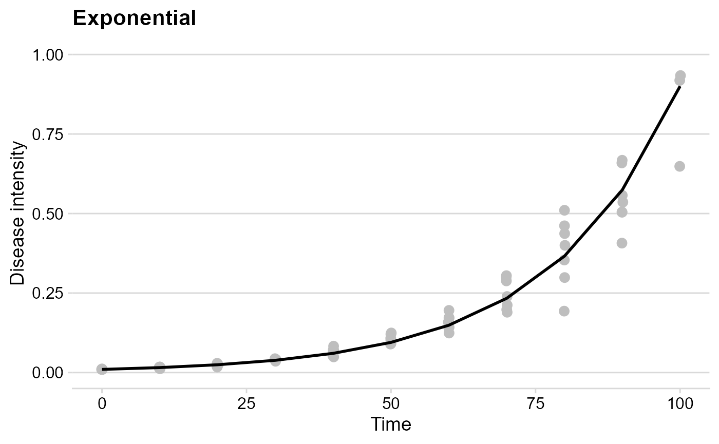
Monomolecular
The logic is exactly the same here.
mono_model <- sim_monomolecular(
  N = 100,
  y0 = 0.01,
  dt = 5,
  r = 0.05,
  alpha = 0.2,
  n = 7
)
knitr::kable(head(mono_model), digits = 4)| replicates | time | y | random_y |
|---|---|---|---|
| 1 | 0 | 0.0100 | 0.0103 |
| 1 | 5 | 0.2290 | 0.2258 |
| 1 | 10 | 0.3995 | 0.4919 |
| 1 | 15 | 0.5324 | 0.5970 |
| 1 | 20 | 0.6358 | 0.6705 |
| 1 | 25 | 0.7164 | 0.7390 |
mono_plot = mono_model %>%
  ggplot(aes(time, y)) +
  geom_jitter(aes(time, random_y), size = 3, color = "gray", width = .1) +
  geom_line(size = 1) +
  theme_minimal_hgrid() +
  labs(
    title = "Monomolecular",
    y = "Disease intensity",
    x = "Time"
  )
mono_plot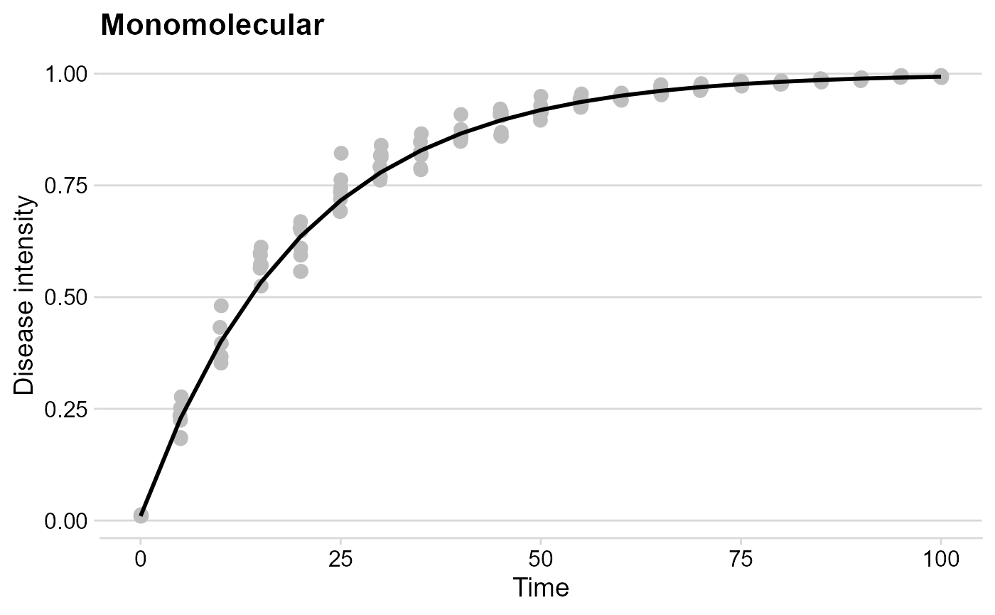
The Logistic model
logist_model <- sim_logistic(
  N = 100,
  y0 = 0.01,
  dt = 5,
  r = 0.1,
  alpha = 0.2,
  n = 7
)
knitr::kable(head(logist_model), digits = 4)| replicates | time | y | random_y |
|---|---|---|---|
| 1 | 0 | 0.0100 | 0.0107 |
| 1 | 5 | 0.0164 | 0.0149 |
| 1 | 10 | 0.0267 | 0.0304 |
| 1 | 15 | 0.0433 | 0.0306 |
| 1 | 20 | 0.0695 | 0.0725 |
| 1 | 25 | 0.1096 | 0.0840 |
logist_plot = logist_model %>%
  ggplot(aes(time, y)) +
  geom_jitter(aes(time, random_y), size = 3,color = "gray", width = .1) +
  geom_line(size = 1) +
  theme_minimal_hgrid() +
  labs(
    title = "Logistic",
    y = "Disease intensity",
    x = "Time"
  )
logist_plot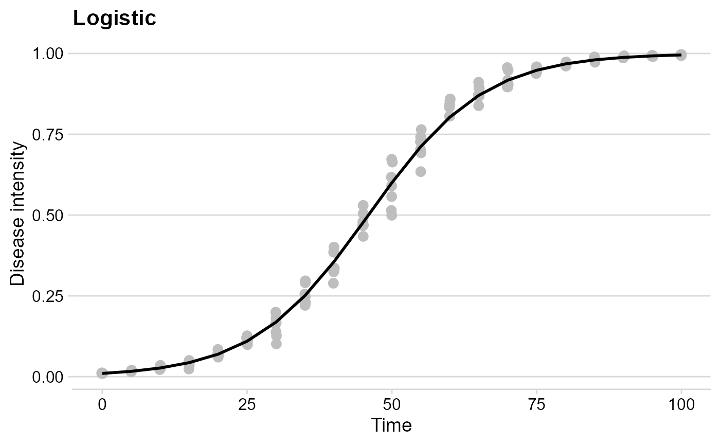
Gompertz
gomp_model <- sim_gompertz(
  N = 100,
  y0 = 0.01,
  dt = 5,
  r = 0.07,
  alpha = 0.2,
  n = 7
)
knitr::kable(head(gomp_model), digits = 4)| replicates | time | y | random_y |
|---|---|---|---|
| 1 | 0 | 0.0100 | 0.0100 |
| 1 | 5 | 0.0390 | 0.0476 |
| 1 | 10 | 0.1016 | 0.1090 |
| 1 | 15 | 0.1996 | 0.1845 |
| 1 | 20 | 0.3212 | 0.3154 |
| 1 | 25 | 0.4492 | 0.5099 |
gomp_plot = gomp_model %>%
  ggplot(aes(time, y)) +
  geom_jitter(aes(time, random_y), size = 3,color = "gray", width = .1) +
  geom_line(size = 1) +
  theme_minimal_hgrid() +
  labs(
    title = "Gompertz",
    y = "Disease intensity",
    x = "Time"
  )
gomp_plot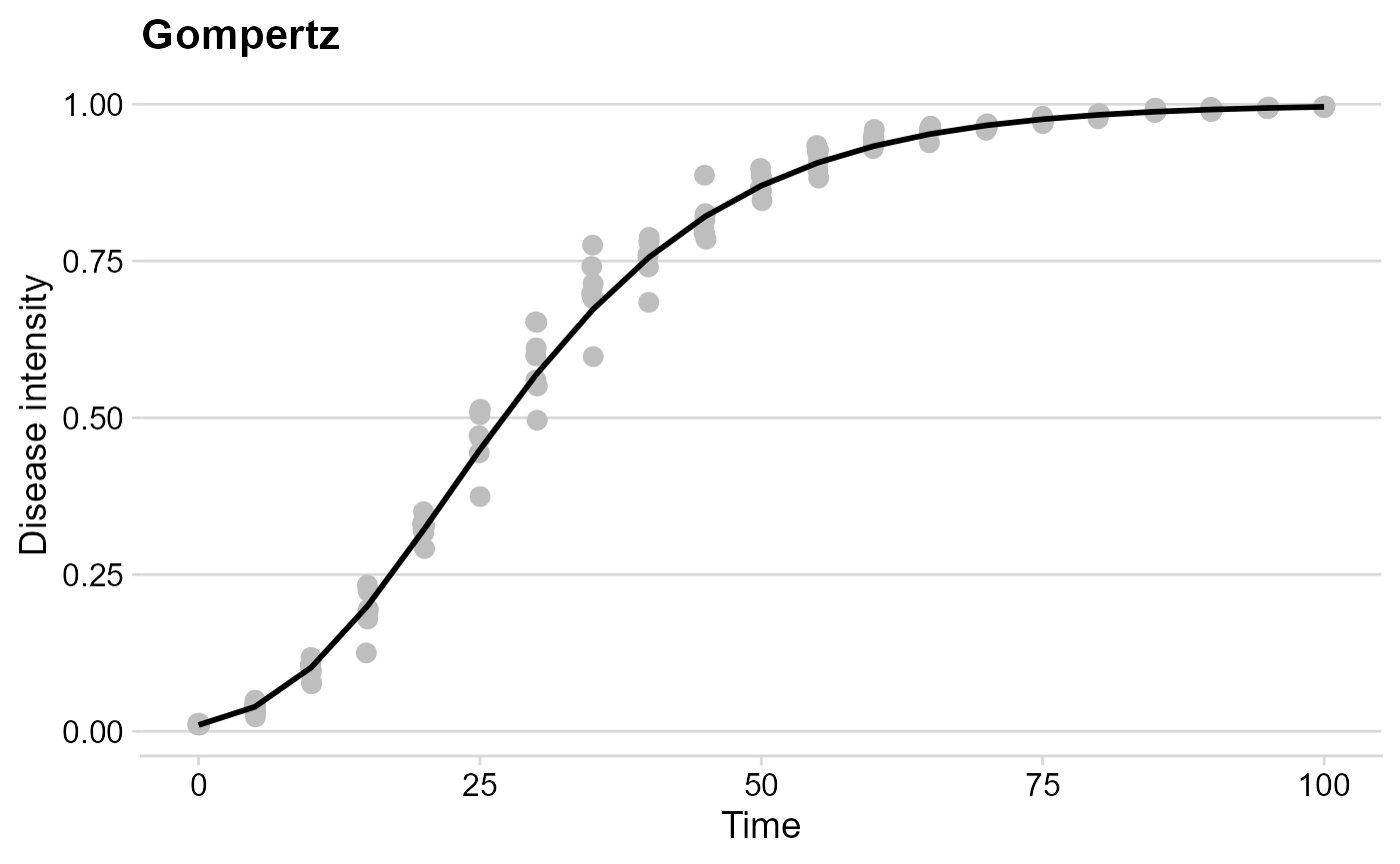
Combo
Use plot_grid() from cowplot
to combine the simulated curves in a grid.
plot_grid(exp_plot,
          mono_plot,
          logist_plot,
          gomp_plot)
## Warning: Removed 1 row containing missing values or values outside the scale range
## (`geom_point()`).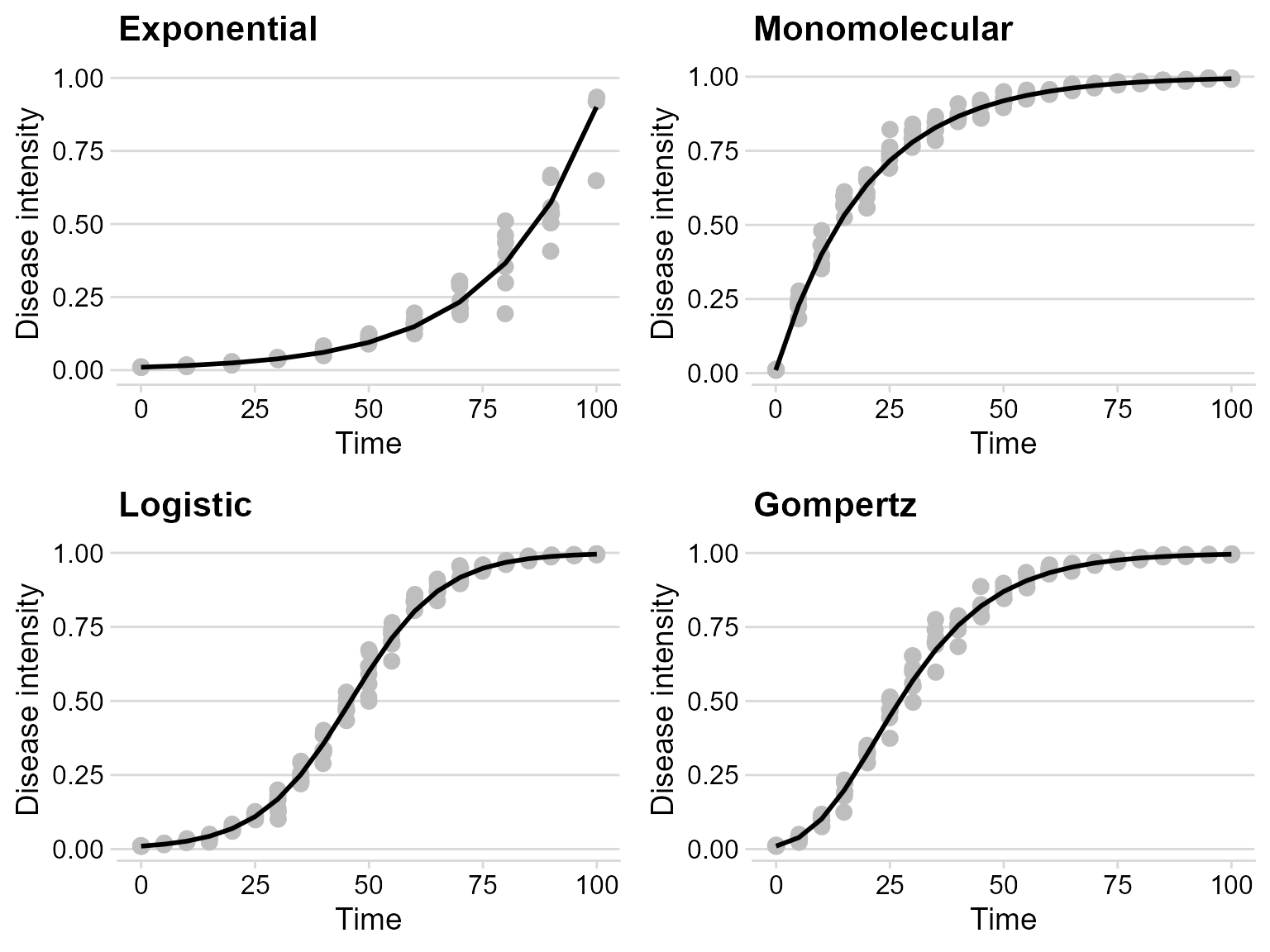
References
Karline Soetaert, Thomas Petzoldt, R. Woodrow Setzer (2010). Solving Differential Equations in R: Package deSolve. Journal of Statistical Software, 33(9), 1–25. DOI: 10.18637/jss.v033.i09